Conceptual Route Map

Amtrak Unlimited Discussion Forum

Help Support Amtrak Unlimited Discussion Forum:

This site may earn a commission from merchant affiliate links, including eBay, Amazon, and others.
Status
Not open for further replies.

DowneasterPassenger

Lead Service Attendant
Joined
May 9, 2009
Messages
344
Location
Portland Maine
amtrak1.jpg


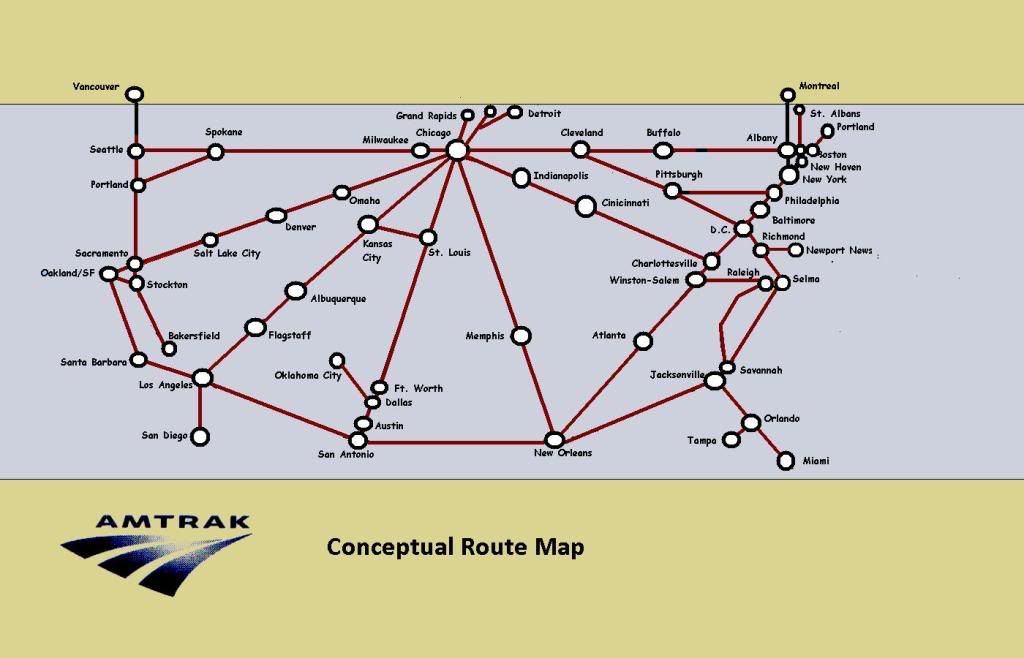
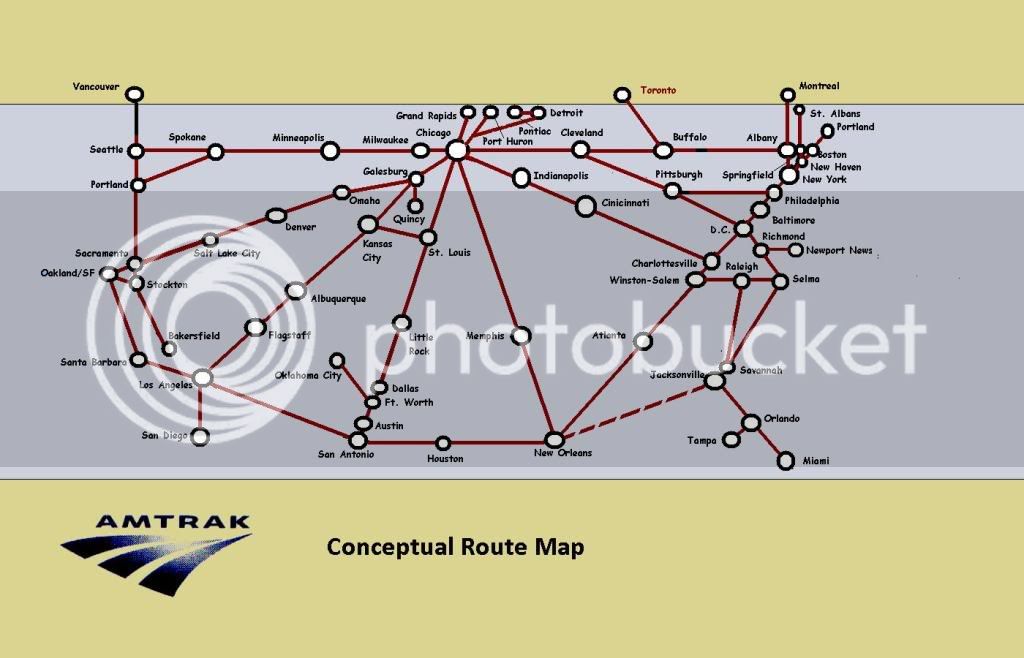
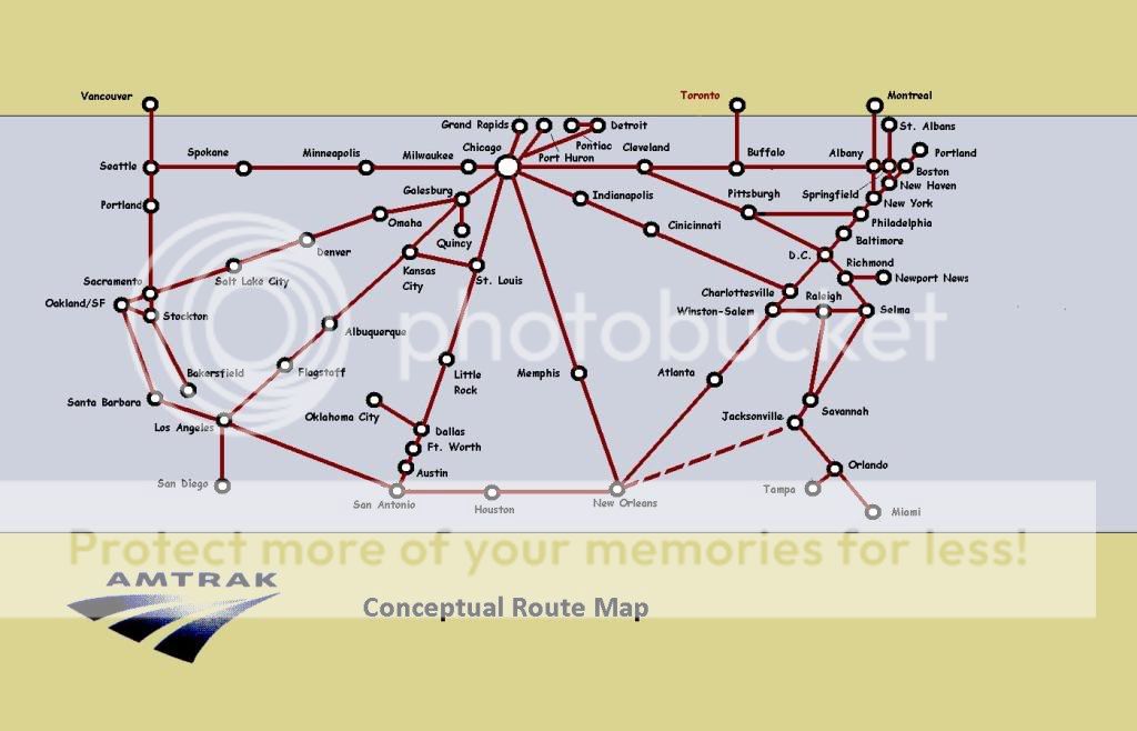
This is an idea I've been thinking about for a while, after looking at lots of Amtrak and rail system maps. I wanted to simplify the national route map. I sketched this with MS Paint but eventually would like to use a drafting program to make it tidier.

I've included major cities and terminals only for now.

See any glaring mistakes? Comments, criticism, feedback, and suggestions welcome.
 
Wow, I like it...very London Undergroundy. My only complaint...you left off my two stations! (MRC and DNC)...but I know why you did.
 
Wow, I like it...very London Undergroundy. My only complaint...you left off my two stations! (MRC and DNC)...but I know why you did.
Yeah, it would be cool to put in the details of every station. There are some oddities that are hard to draw in a map like this. Like, the SWC crosses over the SL before they enter L.A. The "self-transfer" from BBY to BON (or the fact that Boston has 3 stations). Also maybe should have put in GBB and Hammond. Thruway bus routes would be good too.

Here's one source of inspiration:

1971Table.jpg
 
You also left off the Texas Eagle route. How am I suppose to take Amtrak? I don't want to drive 3 hours when I can drive 45 minutes as I can now.
 
I'm more of a map guy, but your rendering does make it easier to see at a glance the connections within the entire national system.

A few minor recommendations:

1. Looks like Dallas and Ft. Worth are swapped.

2. I'd add a few major "midroute" cities... Minneapolis and Houston are the two that I feel should be included.

3. Label the city next to Detroit and the one between Albany/Boston.

4. Don't give Amtrak credit for a New Orleans to Jacksonville route (even if they continue to show it on their national route map).

Very nice work!
 
You also left off the Texas Eagle route. How am I suppose to take Amtrak? I don't want to drive 3 hours when I can drive 45 minutes as I can now.
Uh, I've never taken it, but isn't the Texas Eagle the one that goes from Chicago thru St. Louis, Ft. Worth, Dallas, Austin and then San Antonio? Its crooked route has been turned into a straight line on this map.
Yes it is, and yes it is on there. And someone else beat me to the Fort Worth/Dallas swap, and the HF does not go out of Dallas - it goes from Fort Worth.
 
Nice map! I remember another forum member came up with a similar map. His version had route colors to help illustrate locations served by different trains.
 
amtrak1-1.jpg


Updated version. Thank you for all the suggestions!

If I got the terminology right, I'm going for more of a topological than a metric map. The official Amtrak system map is metric: the routes are imposed on a scaled map of the U.S. and Canada. The idea here is, as was said, more of a "London Underground" style that is topologically correct but not metric, i.e. distances are not reflected accurately.
 
Nice map! I remember another forum member came up with a similar map. His version had route colors to help illustrate locations served by different trains.
I think the confusing thing about route colors is that too many Amtrak routes share the same track routes. It seems like a good idea for LD trains in the west, but then you try coloring the NEC, it turns into quite a rainbow.

It's interesting that in some cities like Boston and L.A., people refer to their subway routes by their color codes, but in other cities like NY they use letter codes, even when the maps are color coded. BART maps are color coded but we call the trains by their destination (i.e. "Richmond train").
 
It's instructive to compare the conceptual route map with Amtrak's first route map of 1971, almost four decades ago. How little it has changed! The route structure still looks like a broken wagon wheel. It's centered on Chicago with several spokes (one or two are missing) and a rim most of the way around the country.

It reflects the demography and politics of another era. The idea of saving passenger trains originated in Chicago, which partly explains the Chicago hub. The major traffics of those days were East Coast to Chicago and to the West Coast, plus East Coast to Florida. The circumferential route evidently was a concession to tourists and tour group operators, because it connects many tourist meccas and avoids dead-ends.

Today, population shifts and travel increases are evident; but mostly Amtrak has added little in the southeastern and south-central half of the country, mostly on state initiative. Many travelers still are expected to make time consuming and expensive detours via Chicago.

The maps' similarity is depressing for its minimal progress.
 
Last edited by a moderator:
I used Corel Draw 8 as I remember. I was kind of new to the concept and software, so the state boundaries are a bit rough, but there actually is a decent bit of inset information present with the time, such as "directional" stations (Board or alight only), connections, and stops skipped by some trains.

The commuter rail and transit info wasn't quite complete then, and is perhaps more dated now. I never did get ambitious enough to plunk baggage symbols at every place where accepted, but that would have been fitting.

Maybe I'll get bored one day and elect to tidy it up and update it, but its interesting nonetheless. I've also seen a schematic-ish map on a Wikipedia link, but I seem to recall it straying from the strict rules of verticals, horizontals, and 45 degree angles.
 
While the QUALITY and CRAFTSMANSHIP is superb, it soooo reminds me of BART, which, is "OK" for a regional transit system.........

But I much prefer a more realistic vs. stylized map version. It may be a generational thing, or just a personal preference, not sure. But gimmie a map that "looks like a map" any day.............
 
Status
Not open for further replies.
Back
Top