Size and boldness matters

Amtrak Unlimited Discussion Forum

Help Support Amtrak Unlimited Discussion Forum:

This site may earn a commission from merchant affiliate links, including eBay, Amazon, and others.
Status
Not open for further replies.

NE933

Conductor
Joined
Aug 17, 2005
Messages
1,107
Location
Queens, New York
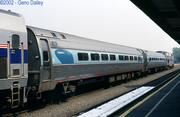
During the fabled '80's, when Phase 2 and 3 designs ruled surpreme, all Amtrak equipment proudly, and gracefully, bore its name in the heavenly fashion befitting such a mighty entity that is the NRPC. AEM7s, Amfleets, Superliners, F40's, and for awhile the Genesis fleet emblazened the rail name that left no mistake to the imagination who we're dealing with. In fact, many other railroads did the same: other greats like Santa Fe, Pennsylvania, Union Pacific made no effort to be polite and reserved.

Now in the age of political correctness, dumbing down, and building for replacement instead of stay-around-til hell freezes, Amtrak's management propagates a letter size and font that reeks of gentrified tidyness. Trains wear the name in dimensions in which the logo itself overpowers the name that gave it birth, instead of the other way around. Even on its website, the appearance of the name shockingly plays second fiddle to terms like 'Guest Rewards', 'Northeast Regional', and other graphics that in which this situation should be the other way around.

The word 'Amtrak' is a name, and like anyone or anything else's, should convey balls, solid grounding, and assuredness to the people thinking of using it. The worst offender is the AEM7-AC fleet as it exists now: once they wore the name like God wears his on heaven's gates. Now the victim of conflicting aesthetics and confusing marraiges of design, the name is on a small plate near the bottom, and the locomotive's features that were as close to perfect in pairing with the Phase 3 scheme as one will ever get, now are grey ghosts that seem like shadows.

The Acela trainsets almost have it right: at least one of the name are bold, and obviously it works. Will Amtrak correct this error with the upcoming (hopefully soon) equipment purchase?

NE933
 
Personally, I disagree. I never liked the Phase III design or the "pointless arrow" logo, but I love Amtrak's current logo and design scheme. It seems attractive and modern, and compares favorably with most other transportation logos I've seen.

There are two versions of the logo: the most common one with the word Amtrak smaller and underneath the much larger graphic element, and a variation with the Amtrak text more prominent and to the right of the graphic (as seen in the bottom right corner of the timetable and most other Amtrak publications). I do think Amtrak should use that version of the logo more often than they do.

But I also think the Amtrak name on the side of the P42s is plenty large and bold enough to be seen easily. It is hard to spot on the AEM7s, but hopefully those won't be around much longer anyway.

I do actually have a problem with the Acela paint scheme. The Acela logo is massive, but the Amtrak logo is way too small. I would rather see a large Amtrak logo, and smaller Acela branding to avoid confusion. A couple of years ago, I was walking with a group of coworkers near a train station as an Acela was pulling in. One of them said something like, "Wow, what kind of train is that? Is it Amtrak?" and a couple of other people said "no, it can't be. It says Acela."
 
I'm with Steven here, you have to look at aesthetics as a whole. Let's take an example from our friends in the airline industry.

1989:

1564290.jpg


2009:

1660387.jpg


Same type of aircraft, same airline, but there is much less emphasis on the Delta name now, it's about the imagery. I think what they're recognizing is that people do much better with images than they do with words. Look at a fast food menu, you see what you're going to eat, not just words on a board. Logos tend to be much more unique than company names. I'm sure this wasn't just done on a whim, I'm willing to bet there are a whole mess of marketing guys doing research and studies on this matter. Now I won't argue that I wish that the company name was a little bit more prominent as it was in the Phase III or IV days, but welcome to reality.
 
You know, my Mercedes Benz doesn't have those words anywhere except under the hood and I like it that way. They are a very well known company and they don't need to plaster their name in huge letters all over my car. Big words don't matter because all words are are set of standardized symbols that represent a specific idea. That same idea can be represented by a singular nonstandard symbol as well. They didn't write the words Mercedes Benz on my car, but ask anyone and they will tell you without hesitation that it is a Mercedes Benz because of the tristar.
 
Sorry, but IMO cleanliness, good service, decent food, and OTP matter one heck of a lot more but to each their own
 
Sorry, but IMO cleanliness, good service, decent food, and OTP matter one heck of a lot more but to each their own
I would have to agree that the level of service offered and the respect for the customer is much more important than the logo/brand/trademark, etc. Granted the logo and the branding approach cannot be sloppy or unprofessional, but passengers don't make their decision on whether they are going to ride the train based on the brand. The brand is important when you have multiple products to sell under one umbrella - ie. Acela, Long Distance Trains, State Trains, etc. The brand logo can pull these different products together effectively and allow for cross marketing.
 
I loved Phase I the most. Phase II was almost as good. Phase III was better than II but not as good as I. IV was ugly as sin. V is marginally better. The "Pointless Arrow" was a good logo. It symbolized what Amtrak was supposed to be about- the coming together of the several passenger rail companies to something bigger, better, and more focused.

The current logo, which I call "three sheets to the wind" symbolizes what Amtrak was during George Warrington's reign- and that's three sheets to the bloody wind.
 
Again looking at an airline example.....

1661603.jpg


It is not unusual to have multiple branding on the same piece of equipment, and depending on the purpose, one of the brands is highlighted more than the other. Ignoring the tail fin for the moment since trains don't have those, and focusing on the fuselage, the primary branding on this one is of Star Alliance, while the primary ownership is presented by the secondary and smaller branding of Singapore Airlines.

So one can argue about whether Acela should be the primary brand or Amtrak should (I think it is fine for the NEC HSR service to be primary branded Acela) and based on that discuss whether the Amtrak brand should be bolder on an Acela train or the Acela brand. But to argue that everything that is Amtrak must have the Amtrak brand displayed the largest is missing the whole point of branding I think.
 
Let me attend to these responses.

Someone stated that logo and paint scheme are not as important as on time performance, cleanliness, and other things that make up high quality. This is true, and I didn't allude to declaring that it wasn't. If we are going to have a method of displaying the name and logo, let's put some due brains into it.

Which brains? Many have included examples of other carriers, like Delta airlines, and Mercedes Benz, in which understatment is the norm and thus the reality, since many people nowadays don't pay attention to actual words and sentences but rather symbols, abbreviations, and the like. Let's forget this generation is nurtured on ritilan, texting while eating dinner, oversized softdrinks, and the throwing in the words 'like', 'actually', and 'defineately' in every sentence; I hardly consider their attempt at guidance in speech to be anything worthwile on our radar screen, that is, unless one of them is a doctor operating on me.

While it is unlikely Amtrak trains will be viewed as a traveling chalk board in which to launch a badly needed improvement in the way our society views language and communication, several posters pointed out contradicting examples like the giant 'Acela' name and logo on the trainsets' locomotives, or the prominent way Amtrak brand is on the Genesis fleet. I just wish the size of the name and the brand logo wasn't at such a disparity. In some advertisements in which graphics are used instead of an actual photo, they have it down pat.

I guess this leads to the logical question : should Amtrak spend millions 'correcting' this on all it's rolling stock? No, of course not. The wise thing to do is for Boardman to sign that damn contract to purchase new cars and engines. And then put physically larger 'Amtrak' on them -- to boldly go where no train has gone before!
 
Let me attend to these responses.
Someone stated that logo and paint scheme are not as important as on time performance, cleanliness, and other things that make up high quality. This is true, and I didn't allude to declaring that it wasn't. If we are going to have a method of displaying the name and logo, let's put some due brains into it.

Which brains? Many have included examples of other carriers, like Delta airlines, and Mercedes Benz, in which understatment is the norm and thus the reality, since many people nowadays don't pay attention to actual words and sentences but rather symbols, abbreviations, and the like. Let's forget this generation is nurtured on ritilan, texting while eating dinner, oversized softdrinks, and the throwing in the words 'like', 'actually', and 'defineately' in every sentence; I hardly consider their attempt at guidance in speech to be anything worthwile on our radar screen, that is, unless one of them is a doctor operating on me.

While it is unlikely Amtrak trains will be viewed as a traveling chalk board in which to launch a badly needed improvement in the way our society views language and communication, several posters pointed out contradicting examples like the giant 'Acela' name and logo on the trainsets' locomotives, or the prominent way Amtrak brand is on the Genesis fleet. I just wish the size of the name and the brand logo wasn't at such a disparity. In some advertisements in which graphics are used instead of an actual photo, they have it down pat.

I guess this leads to the logical question : should Amtrak spend millions 'correcting' this on all it's rolling stock? No, of course not. The wise thing to do is for Boardman to sign that damn contract to purchase new cars and engines. And then put physically larger 'Amtrak' on them -- to boldly go where no train has gone before!
Consider pretty much every major religion has a symbol that represents it. Christan have the cross, Jews have the star of David, Muslims have the crescent moon and star. You ever heard a thing called a family coats of arms? It is a symbol How about flags, those are symbols as well. It sounds like you would you rather have a banner that reads "United States of America" instead of the stars and stripes. Symbols have been used since the birth of man; they are not a product of the big gulp texting generation. Heck any of the world's alphabets are just a group of symbols that can be arranged in a specific order to represent an idea.

People are stupid these days, but people have always been stupid and symbols have nothing to do with it. It sounds like you need your own personal traveling chalk board for lesson in logic.
 
Let's forget this generation is nurtured on ritilan, texting while eating dinner, oversized softdrinks, and the throwing in the words 'like', 'actually', and 'defineately' in every sentence; I hardly consider their attempt at guidance in speech to be anything worthwile on our radar screen, that is, unless one of them is a doctor operating on me.
Since Neil is not here and I can make self-deprecating remarks about myself without watching him try to shove them down my throat as an insult...

First off, I took ritalin as a child. Ritalin is as over-prescribed as ADHD is over-diagnosed, I admit that. I do, however, have ADHD, which is one of the worst things you can possibly have, and I wish it on nobody.

Imagine, if you will, sitting in class. The teacher is talking. You WANT to listen. You WANT to learn. You WANT to hear. You WANT to pay attention. But you can't. Because everything from the heater fan to the fluorescent light buzz to the tapping of a kid's foot is grabbing your attention. Your mind is not LETTING you focus on what you WANT to focus on.

Instead you feel like putting your hands over your ears, curling up into a ball, and screaming because everything but what you want to experience is banging in your head like the sound you'd hear standing right next to a high-balling F40s prime mover. The background noise of everyday life becomes your main event horizon. That is what ADHD is. That's what it feels like.

And Ritalin then, Adderall now, essentially allows me to grab the volume knob for all that din and turn it down to a volume where its there, but its not stopping me from concentrating on what matters. ADHD is an honest-to-god serious disorder for which really prevents otherwise capable people from performing well- or even, in some cases, functioning. I take offense to your blanket statement about it.

Now, I'm not going to say that there aren't a lot of essentially bad apple, stupid, or simply miss-behaving jackass kids out there that people try to apologize for by justifying it with "oh, he has ADHD"! But not all of us ADHD kids fall into that category.

Now, I'm not apologizing for myself. In addition to having ADHD, a condition that over time I have managed to almost completely overcome with a combination of medication and willpower, I happen to a heel. I'm not going to say that the problems I had earlier in life didn't influence my personality. Surely, it very much did so. But I take responsibility for it in its entirety.

Further, like I, actually, definitely, like talk, like, an actually, like, definitely, moron-type like actual definite like person, like. We're not, like, all, like, actually, like, like, that, like, dude, definitely. God, I was planning on writing this entire paragraph like this, but I can't even stand doing it.

This isn't a generational thing. This is a human thing. I have said it before. And I am sure I will say it again:

Humans are stupid.

As for Amtrak's paint schemes, I'm going to be honest with you. This paint scheme was a Warrington change, and I don't like it. But what Amtrak needs more than a nice paint scheme is a unified one. Can you remember when Phase I, phase II, phase III, and even phase IV could be found on the same train? I'll give Amtrak this. Only a few cars remain in Phase IV, almost everything is in Phase V, and it looks, for the first time, almost professional.
 
I loved Phase I the most. Phase II was almost as good. Phase III was better than II but not as good as I. IV was ugly as sin. V is marginally better. The "Pointless Arrow" was a good logo. It symbolized what Amtrak was supposed to be about- the coming together of the several passenger rail companies to something bigger, better, and more focused.
The current logo, which I call "three sheets to the wind" symbolizes what Amtrak was during George Warrington's reign- and that's three sheets to the bloody wind.
Unfortunately, I have little idea what you are talking about. (My fault, I suppose, not yours).

What is Phase I? Phase II? (et cetera).

The "Pointless Arrow" I can figure out (the image, if not the particular "Phase").

The current logo (the "three sheets to the wind") I can figure out, too.

Can somebody point me to each of the five "Phases" GML mentions (perhaps links, if not actual embedded images).
Phase I was a wide red stripe, a wide blue stripe, with a thin white stripe between them, and a pointless arrow next to each vestibule. Phase I

Phase II was like Phase I, but minus the Arrow. Phase II

Phase III was like Phase II but the stripes were equal-width Red, White, Blue. Phase III

Phase IV is like what we have now, except there was no red stripe along the bottom of the car, the blue was slightly different, and the labels were a bit different. There was no logo, just "Amtrak", and it wasn't "Coachclass/Businessclass/Firstclass", it was "Coach/Custom/Club". Phase IV

Phase V is what we have now. Phase V
 
Last edited by a moderator:
Phase I was a wide red stripe, a wide blue stripe, with a thin white stripe between them, and a pointless arrow next to each vestibule. Phase I
Why is one car in this picture prominently named "Regal Dome" but has no apparent dome? :blink:
It is ex-ATSF 1813 built by American Car & Foundry as a 4 double bedroom, 2 drawing room, 2 compartment sleeper. Given that ATSF also ordered its pleasure domes from Pullman Standard that same year, I'm going to guess it was bought for the Super Chief and named to reflect the presence of a dome elsewhere on the train.
 
First off, I took ritalin as a child. Ritalin is as over-prescribed as ADHD is over-diagnosed, I admit that. I do, however, have ADHD, which is one of the worst things you can possibly have, and I wish it on nobody.


The background noise of everyday life becomes your main event horizon. That is what ADHD is. That's what it feels like.


And Ritalin then, Adderall now, essentially allows me to grab the volume knob for all that din and turn it down to a volume where its there, but its not stopping me from concentrating on what matters. ADHD is an honest-to-god serious disorder for which really prevents otherwise capable people from performing well- or even, in some cases, functioning. I take offense to your blanket statement about it.

Your Ritalin, my Lithium. I enjoy the noises as long as they result in an elevated mood, but not too elevated, otherwise I gotta summon up extra mgs. of seroquel. Ditto if i'm in the depths of hell. Sometimes folks say things that **** me off, but it's better I guess to take the energy of feeling offended and using it to put our poorly run mental health system on parity with physical. Then Green Lion one day you and me can dance to the same happy tune without the rollercoaster mood cycles, and then turn it off later on.

guessing guest says

Consider pretty much every major religion has a symbol that represents it. Christan have the cross, Jews have the star of David, Muslims have the crescent moon and star.

Certainly, certainly. Wonder which one i pick for today. but it's not that important as long as we pray and/or work for things like peace and compassion for others. Get to work, buddsky.

I love Amtrak and it's symbol, just wish they printed differently. Thank y'all!
 
Last edited by a moderator:
Actually, what you're referring to as Phase V is generally considered to be more of IVb because it's almost identical to Phase IV.

Phase V is more this or this if it's on the Amfleet (AFAIK the only car the "Acela" scheme was applied to).

My information is more railfan-ish so if yours is quite a bit more official, then I'll of course yield to that :p
 
I don't think the debate was ever officially settled whether the cars are in IVb or VI. But then again I have fallen out of the loop a few times.
 
I don't think the debate was ever officially settled whether the cars are in IVb or VI. But then again I have fallen out of the loop a few times.
I'd say we are mainly in Phase V. Just to clarify, there are no VI's (or sixes, yet) and the 'a/b' distinction was in the V, not IV (this gets a bit hairy to follow, but my obsessions make it a peace of cake, served in the diner, hee hee). The 'a/b' distinction was to acknowledge there were 2 variations of Phase V in the way that the Genesis locomotives were painted; 'a' had a higher red reflective stripe than 'b' does. Also adding to the confusion is that IV and V are similar, thier main differnece is that the blue stripe was closer to indigo, whereas now it's more teal. Hope that helps, and keep on pushing for a coming together of the minds down there in Florida. I'd love to take Amtrak over the FEC and from Orlando to New Orleans one day.
 
I personally would argue that for passenger cars Phase V was the "boob job" paint scheme. Remember these days?

82511A.jpg


So if that was Phase V then what do we have on the cars these days?
 
My understanding is that has retroactively been termed "acela scheme" cars. Also known as the "retarded looking" cars.
 
I personally would argue that for passenger cars Phase V was the "boob job" paint scheme. Remember these days?
82511A.jpg


So if that was Phase V then what do we have on the cars these days?
Simple: the boob job is just that, a failed experiment that was an offshoot of the Acela highspeed trainsets, that is: to make the Amfleets look like them. Didn't work, and it never became an official PHased paint scheme, no more than Cascadess' brown and dark green is one. The Acela logo conflicted with the Amfleets' sleek, linear fluting, and we give a slap on the hand to the designer who said it would work. Luckily it didn't get very far.
 
I personally would argue that for passenger cars Phase V was the "boob job" paint scheme. Remember these days?
So if that was Phase V then what do we have on the cars these days?
Simple: the boob job is just that, a failed experiment that was an offshoot of the Acela highspeed trainsets, that is: to make the Amfleets look like them. Didn't work, and it never became an official PHased paint scheme, no more than Cascadess' brown and dark green is one. The Acela logo conflicted with the Amfleets' sleek, linear fluting, and we give a slap on the hand to the designer who said it would work. Luckily it didn't get very far.
Actually it wasn't done just to make the Amfleets look like the Acela's, Amtrak's original plans included naming everything on the NEC Acela something. We were going to have Acela Express, Acela Regional, and Acela Commuter. It was a bad idea that thankfully never came to full fruition, although IIRC we did get so far as to see some trains renamed. However, it caused considerable confusion for the riding public, not to mention considerable anger.

Amtrak was busy running commercials for Acela Express showing the nice new gleaming trainsets. People didn't notice that they weren't booking Acela Express and were very disappointed when their old Acela Regional pulled up without the nice pretty cars with the big windows. The experiment didn't last long, and I don't believe that all routes actually got rebranded before the idea was tossed.
 
I don't believe that all routes actually got rebranded before the idea was tossed.
Everything on the NEC got rebranded, but not on the Empire and Keystone corridors, as was planned. That is when the grand old names got their final brooming.
 
Status
Not open for further replies.
Back
Top